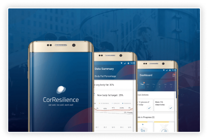
CorResilience: The personal performance coach
A dynamic new personal resilience application, enabling a company’s workforce to achieve profound & sustainable changes in their lifestyle habits, while actively reducing long term risk of disease.
overview
CorResilience began as a vision to drive personal and organisational resilience. Through collaborative workshops, we transformed this concept into a dynamic personal resilience application. This digital platform enables a company's workforce to achieve sustainable lifestyle changes while reducing long-term disease risk. It represents an evolution of CorPerformance's decade-long experience in developing coached behavioural change processes for the corporate market across Europe, the Far East, and North America.
exploration & discovery
Our main challenge was translating CorPerformance's proven analog program into a robust digital offering. We focused on creating a seamless UX experience that keeps users engaged and supports their journey towards better health and resilience.
defining requirements through product discovery
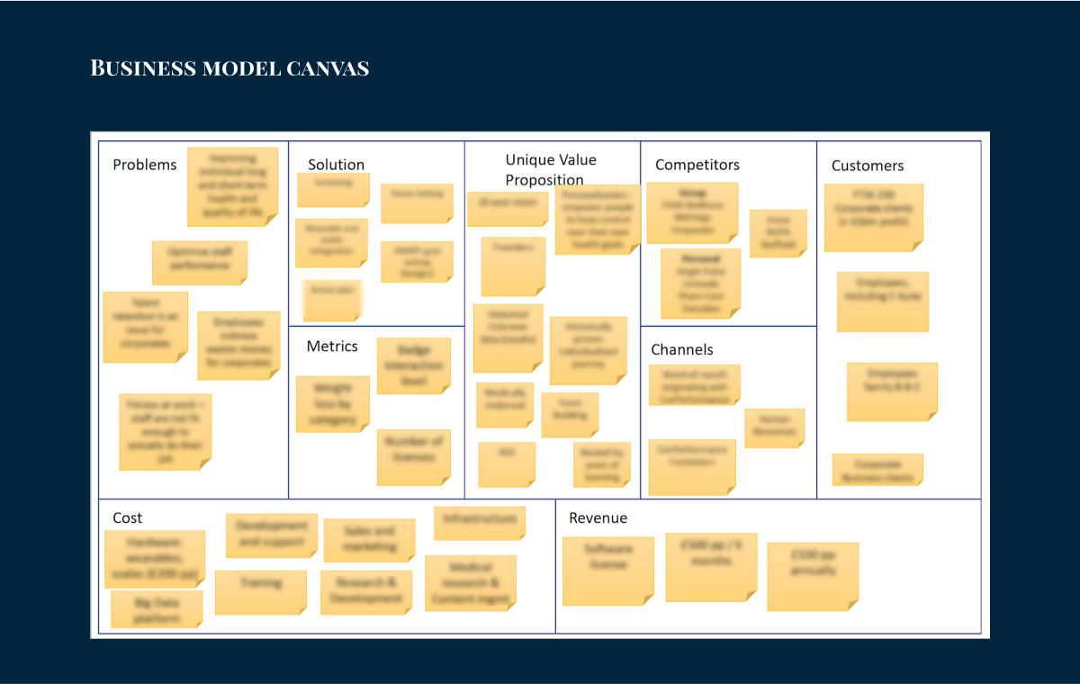
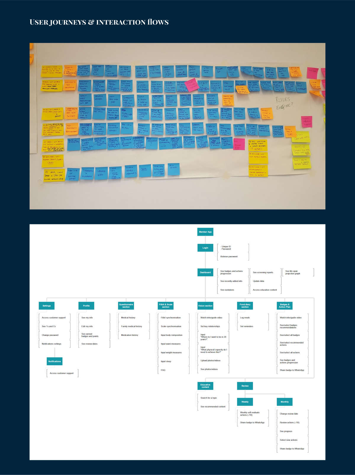
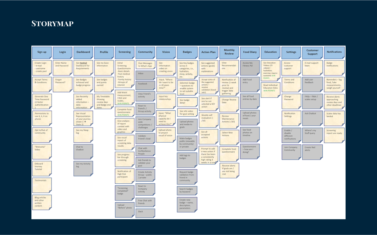
We conducted a structured interactive workshop to guide the client through the solution development process. In this session we defined the business model, user interface and key functionality, culminating in a clear product vision and story map.
The primary goal was for our team to define the Minimum Viable Product (MVP) and ensure that product features aligned directly with business objectives.
project goals
As the project's designer, my challenge was to bring CorResilience's vision to life in an engaging app. After the PD, I consulted with the team and made specific design decisions for each user goal, ensuring the final product was not only simple but — more importantly — fun to use.
Goal 1: Enabling Resilience
An intuitive UI based on four pillars — Recovery, Nutrition, Physical Activity, and Wellness Mindset.
Goal 2: Sustainable Lifestyle Changes
A user journey integrating health screening, personalized education, and coaching.
Goal 3: Leadership Development & Productivity
Graphical features to visualise progress and display improvements in efficiency and performance.
Goal 4: Stress Management
Easy-to-understand visuals and actionable insights highlighting the connection between lifestyle
choices and stress-coping capacity.
Goal 5: Team Building
Shared experiences encouraging co-workers to embark on health journeys together.
UX research
ensuring user engagement & retention
The biggest challenge that we had to address was keeping users interested in the app. To create an app that people actually want to use we had to look at what makes users stick around and testing ideas with real people.
Forrester Research 2015: US and UK smartphone owners use on average 24 apps, but spend more than 80 percent of their in-app time on just 5. Additionally, most users will abandon an app within 30 days of download.
1
A compelling onboarding experience to inspire and motivate users
2
Gamification elements that reward desired behaviors
3
A community aspect leveraging social proof
4
Strategic messaging and system responses through thoughtfully crafted alerts and notifications
5
A simple UI for intuitive use
prototyping & user testing
The prototyping and user testing phase was crucial for our project. We created a high-fidelity prototype to test key features before finalising the MVP, which saved time and resources. This process helped align the initial designs with the client's expectations and validated our core assumptions.
User testing provided valuable insights into how people actually used the app. We uncovered surprising preferences and navigation patterns. This real-world feedback was invaluable, giving us confidence in our decisions. By the end of this phase, we felt well-prepared to move forward with full development.
These insights were crucial in shaping our understanding of what users really needed and wanted. They definitely influenced our design decisions for the final product, helping us create something that was not just functional, but truly user-friendly and engaging.
design toolkit
Axure & Overflow for user flow and architecture diagrams
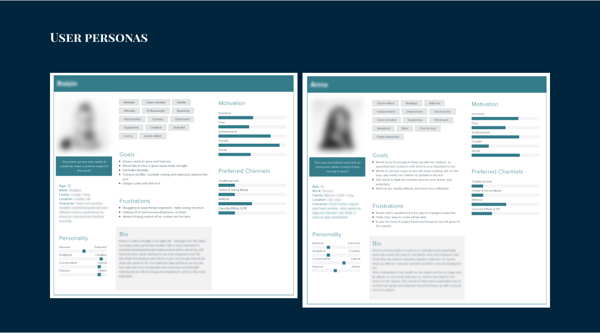
Xtensio for user personas and documentation
Adobe Illustrator for initial prototyping, UI design, and creating high-fidelity mockups that we later imported to Proto.io. We kept the original Illustrator prototype as a reference point.
Sketch for developing consistent mobile UI designs during development. Its prototyping features helped maintain transparency with stakeholders and gather feedback effectively.
Zeplin for sharing designs with developers, providing easy access to specifications like dimensions, typography, and colour palettes.
the principles of MVP
The MVP focused on creating a streamlined user experience with only the essential features. This allowed me to design an interface that met the core needs of early adopters whilst validating the key design assumptions. By prioritising simplicity and usability, our team could quickly deliver a product that users could interact with, providing valuable feedback for future iterations.
The design process followed the Build - Measure - Learn cycle, where we created initial designs, gathered user feedback, and refined our approach. This iterative method helped us minimise design effort whilst maximising learning, ensuring that each design decision was informed by real user interactions and preferences.
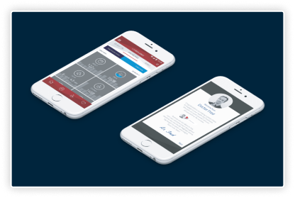
visuals
As a member of the scrum team, I was responsible for the strategy, design, and delivery of the app for both Android and iOS platforms. I led the design process, creating all major deliverables and presenting them to the client. During our sprint cycles, I collaborated closely with our Product Owner and developers, receiving immediate feedback and support to deliver design stories on time.
splashscreen & account activation
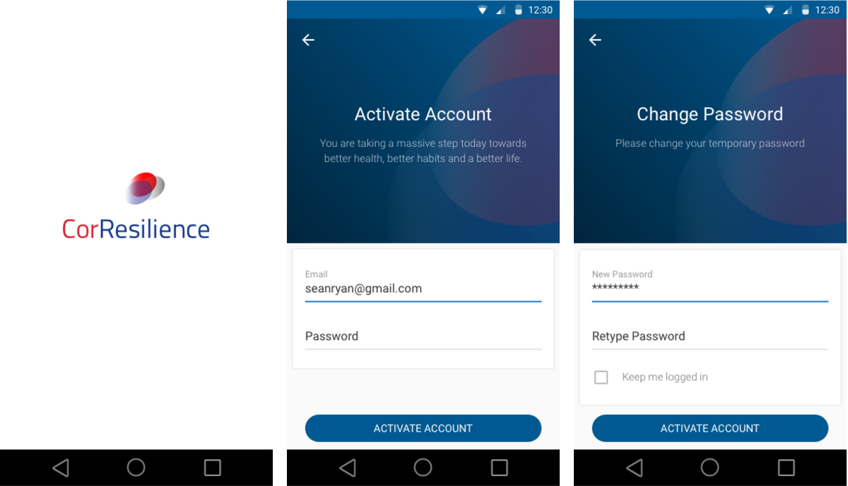
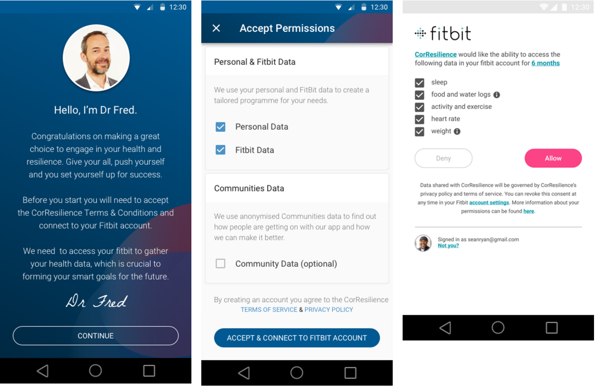
accepting T&Cs and syncing devices
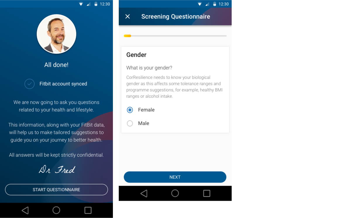
data collection (screening questionnaire)
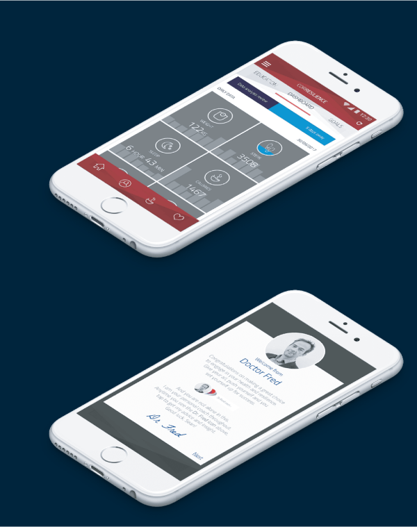
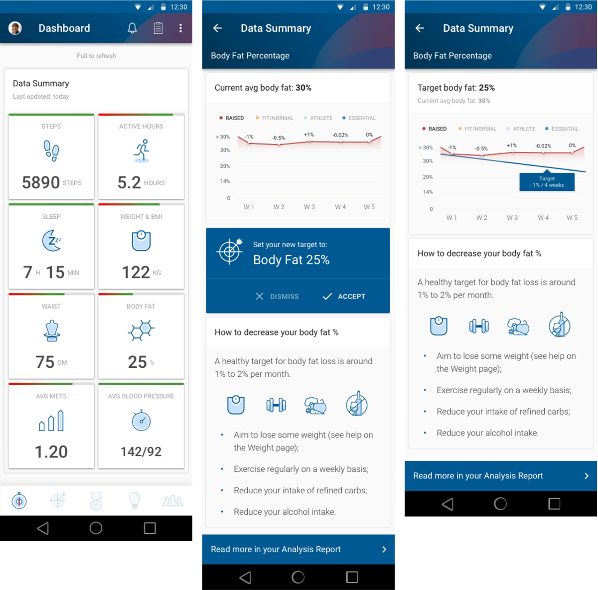
dashboard & goal setting example design
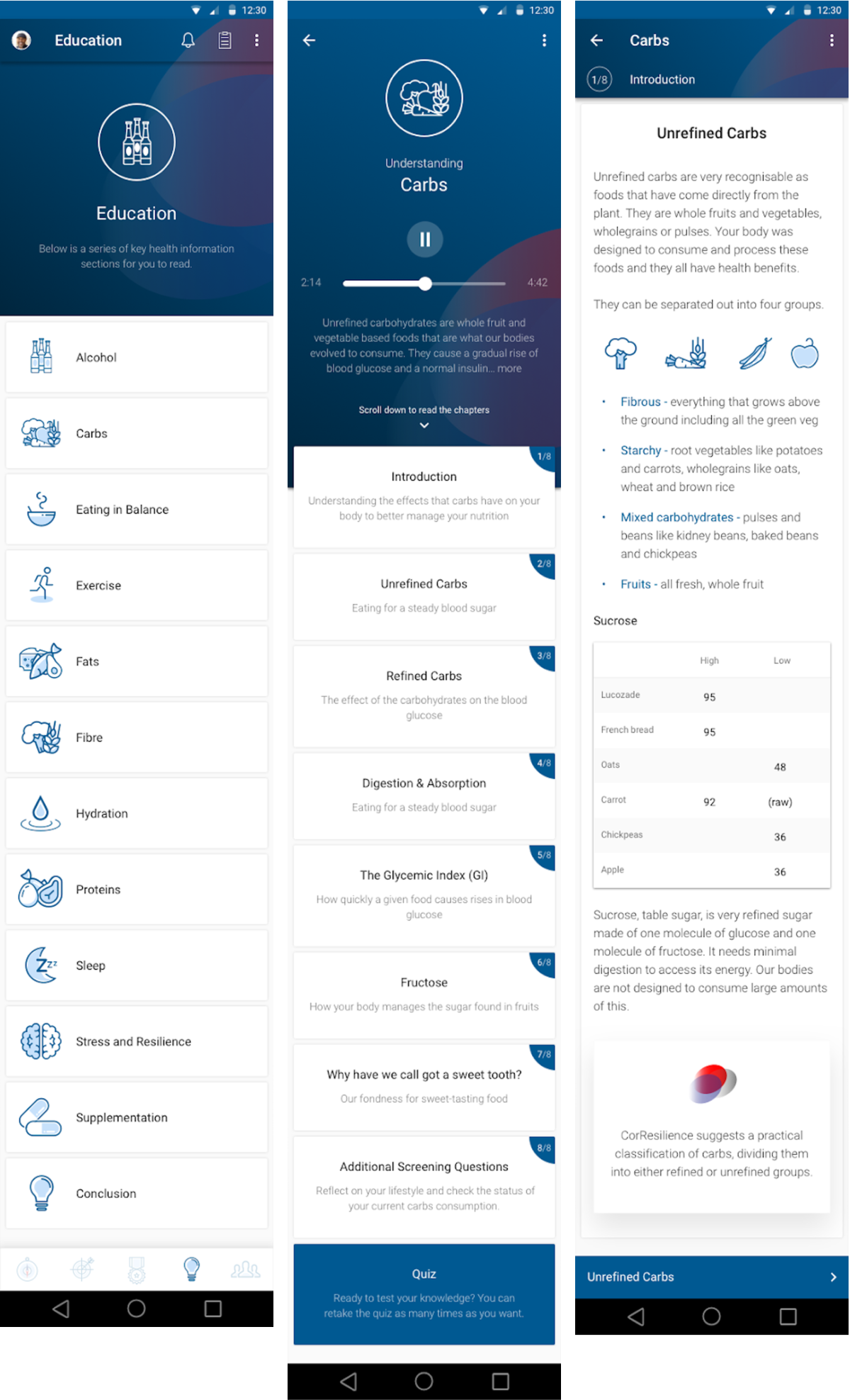
education
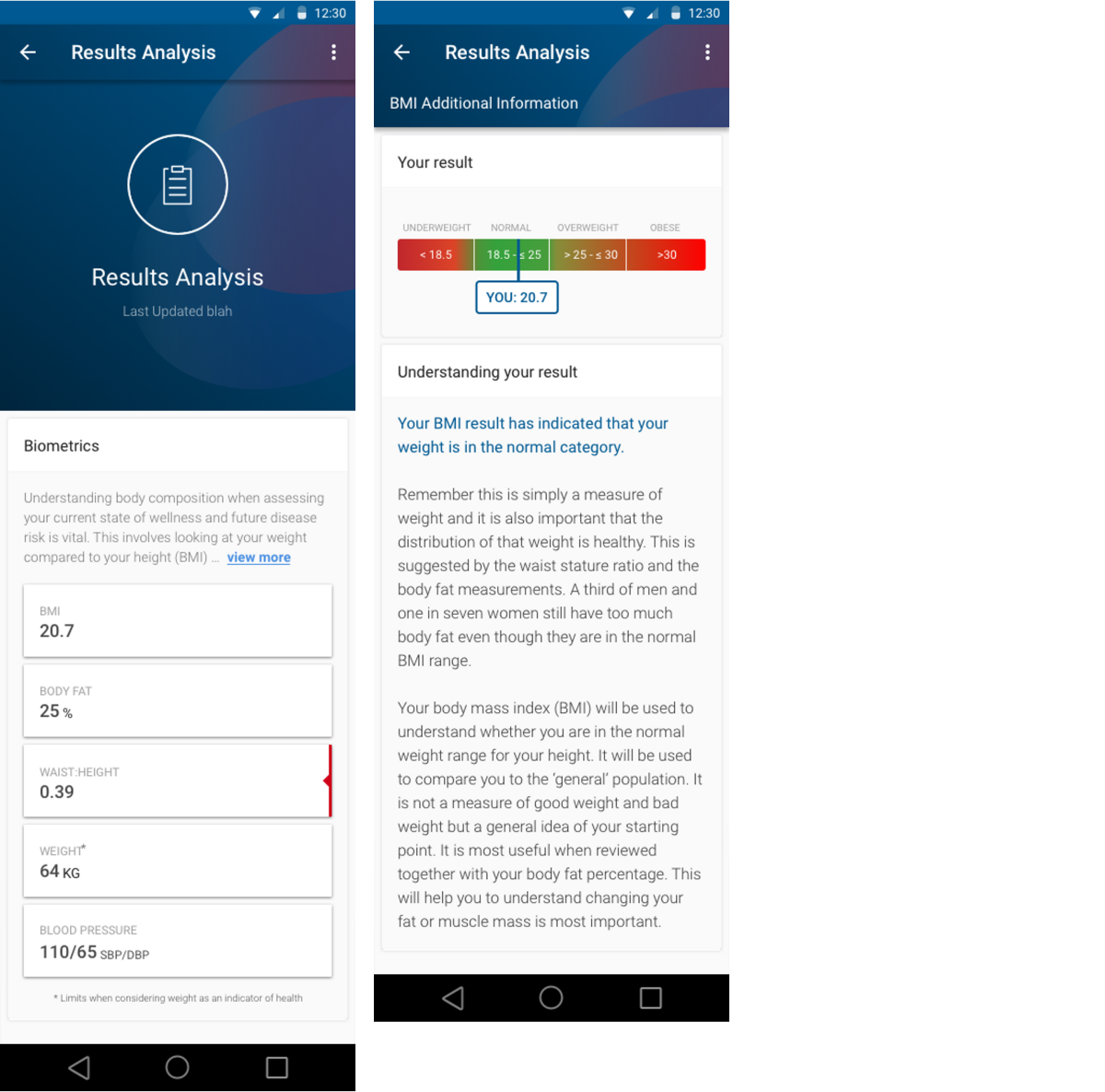
results analysis
profile - vision & goal setting
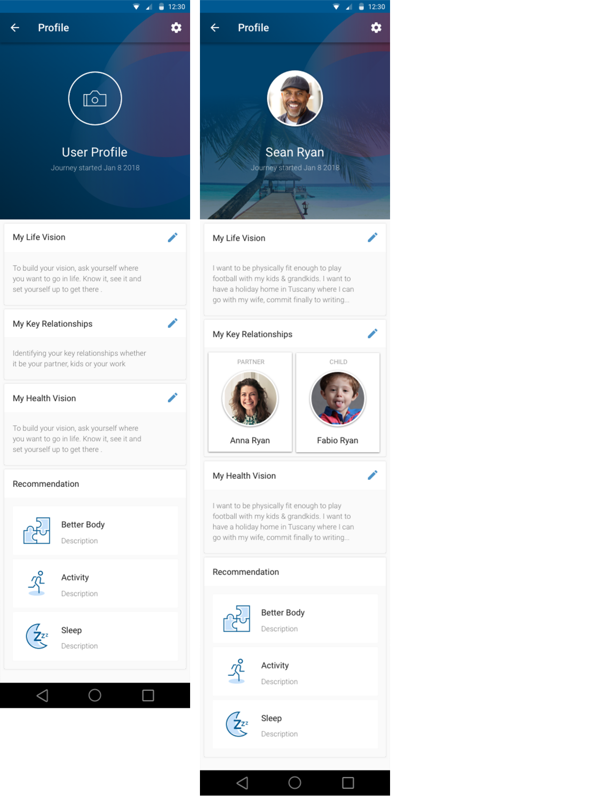
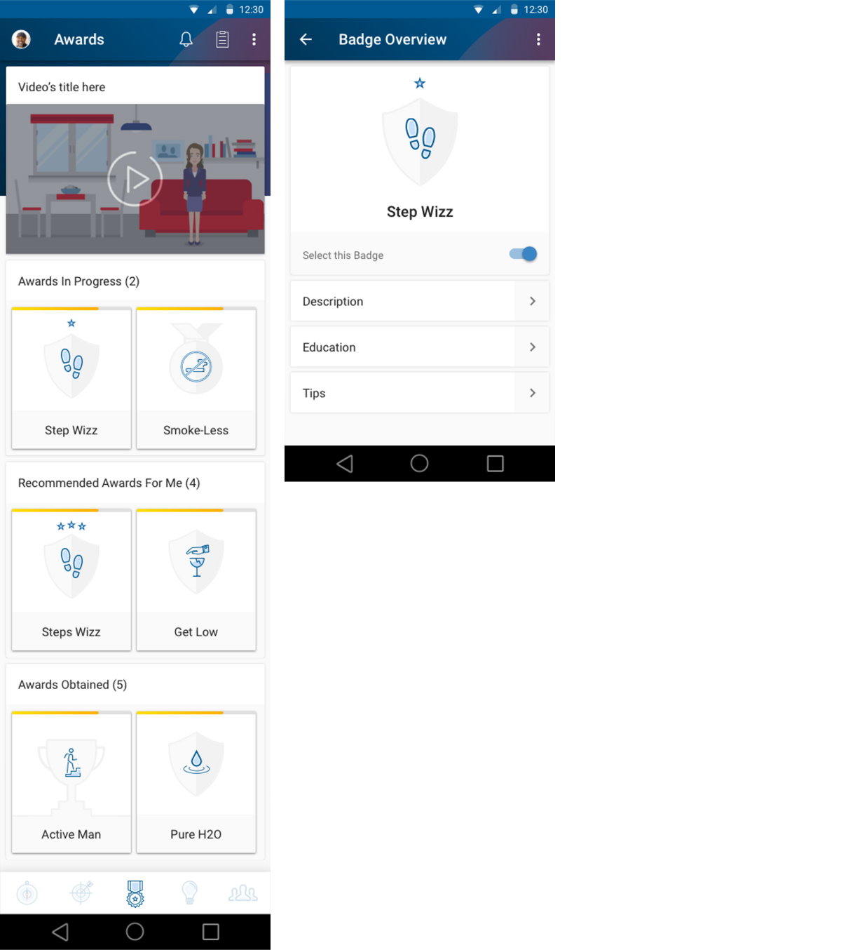
badge selection & coaching
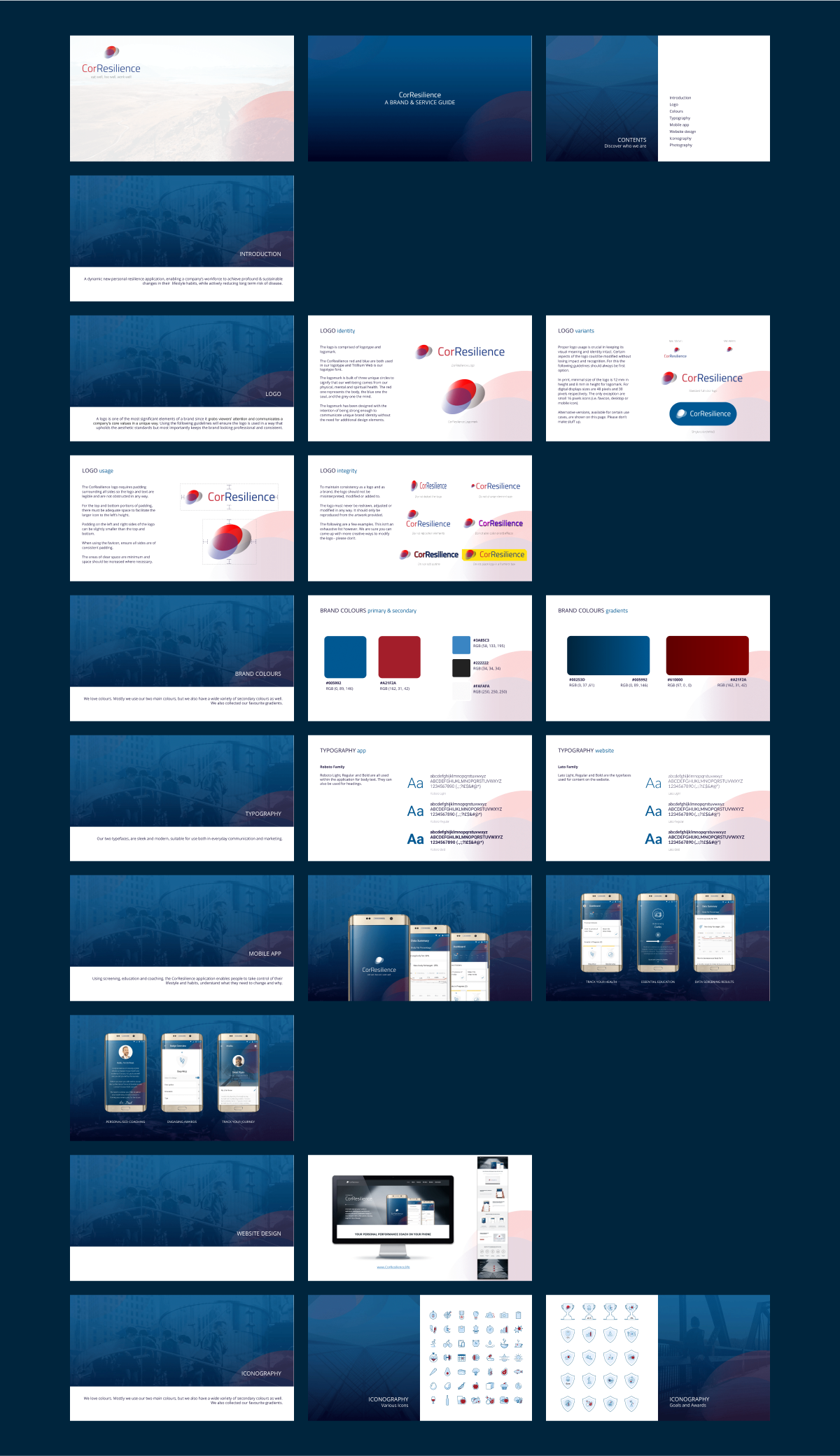
brand & service guide
MVP impact
iterative testing & validation
Testing helped us make informed decisions and feel more prepared and confident for full development. It allowed us to validate key features early on, align and re-align the design with the client expectations, and uncover surprising insights about user preferences.
To stay focused on developing an app that meets user needs and encourages retention, we constantly tested ideas and assumptions throughout the design and implementation process.

First, we tried out the original programme ourselves to understand what motivates users
Then, we got testers to try our prototype before building anything
Finally, we invited early users to workshops and tracked how they used the app, giving us ongoing feedback to improve the product
Early metrics
Despite limited comprehensive data at the MVP stage, initial metrics revealed promising results.
These early indicators suggested that the MVP design was on the right track, providing a solid foundation for future development and expansion of the CorResilience app.
User Adoption:
~40% of employees in the pilot company downloaded the app within the first month.
User Retention:
~50% of initial users remained active after one month, surpassing the average 30-day retention rate for
new apps.
Engagement:
Users averaged 5 minutes of daily app usage, indicating strong initial engagement.
User Feedback:
~70% of surveyed users reported that the app was helpful in tracking their health goals.
Client Satisfaction:
The pilot company expressed interest in expanding the program based on positive employee feedback.
user feedback
Users generally found the app's interface intuitive and easy to navigate. Many appreciated the dashboard feature for providing a quick overview of their progress. The personalised goal-setting functionality was often cited as a motivational tool that helped users stay focused on their health journey.
Additionally, the educational content received positive feedback for being informative without overwhelming users, helping them understand the rationale behind their lifestyle changes.
areas for improvement
1
Some users reported that notifications were too frequent and requested more control over their frequency.
2
There were suggestions for enhanced social features to enable more interaction between colleagues using the app.
3
Users expressed interest in broader integration capabilities with other health apps and devices for a more comprehensive health data view.
learnings
the importance of prototyping and user testing
Testing helped us make informed decisions and feel more prepared and confident for full development. It allowed us to validate key features early on, align and re-align the design with the client expectations, and uncover surprising insights about user preferences.
the value of an iterative, hands-on design approach
The team constantly tested ideas and assumptions throughout the design and implementation process. We tried the original program ourselves, tested prototypes with users, and invited early adopters to workshops for ongoing feedback. This helped us to stay focused on developing an app that meets user needs and encourages retention.