Product Revamp:
Origin's Funding Matrix
During the global slowdown, our team took advantage of the opportunity to enhance our platform's performance. We stepped back to reevaluate the user experience of our core features. Our goal was to streamline these workflows, creating a more intuitive and user-friendly product that would help users make faster, better-informed decisions.
the challenge
The Funding Matrix is the most used feature in our Marketplace product. It allows dealers across DCM, Syndicate, and Sales to quickly search our issuer database, finding those seeking funding who match specific criteria such as yield, spread, and ratings.
As the feature evolved over the years, new additions crammed more functionality into the product, making the old interface complex and difficult to use. With our growing understanding of user requirements, we recognised the need for a comprehensive redesign.
the approach
Our first step was to conduct thorough research, examining all the feedback we'd received and analysing the usage data. After identifying the key issues, we started from scratch to create a cleaner, more intuitive user journey that retained all the powerful features and functionality of the original tool.
1
Performance: While we work on high-spec MacBooks, we know our users operate on a wider range of machines. It's crucial for us to design and optimise for various specifications, with speed as a priority.
2
Intuitiveness: The old Funding Matrix required significant guidance and teaching to use effectively.
3
Data visibility: Users need to see as many funding levels as possible on screen — similar to tools like Excel.
the solution
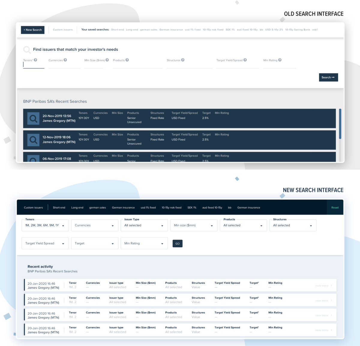
search interface
The search interface is the cornerstone of the tool, as all user journeys begin there. Naturally, we started the user interface revamp with this crucial component.
We maintained the overall layout of the page, keeping the search component at the top and recent activity at the bottom. However, we implemented Material Design — a visual design language developed by Google—to enhance the digital interface's sleekness and improve its usability. Saved searches now take center-stage on this page. Combined with a streamlined search form, they create an immersive, distraction-free experience.
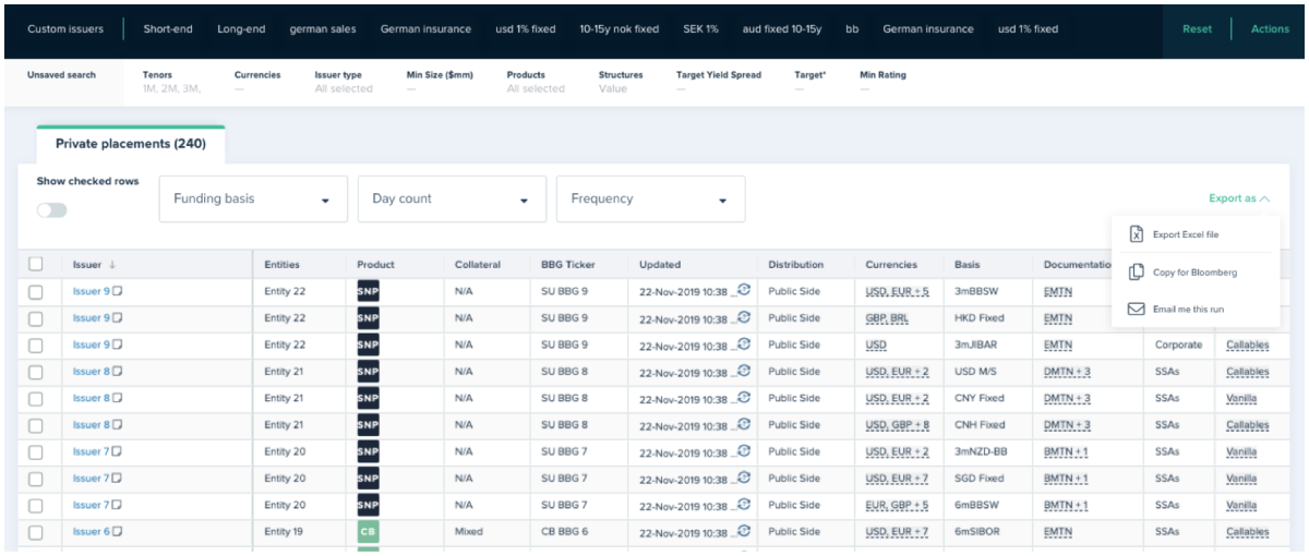
funding matrix
Next we focused on the actual Funding Matrix view. We drew inspiration from travel search websites like Skyscanner, which excel at providing flexible search interfaces for complex requirement. These sites allow users to enter search terms and then easily modify them without starting over.
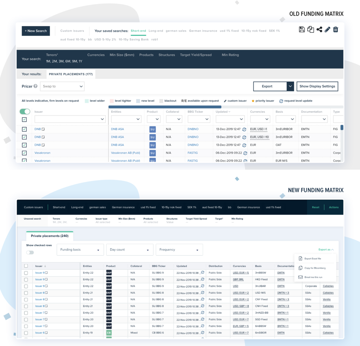
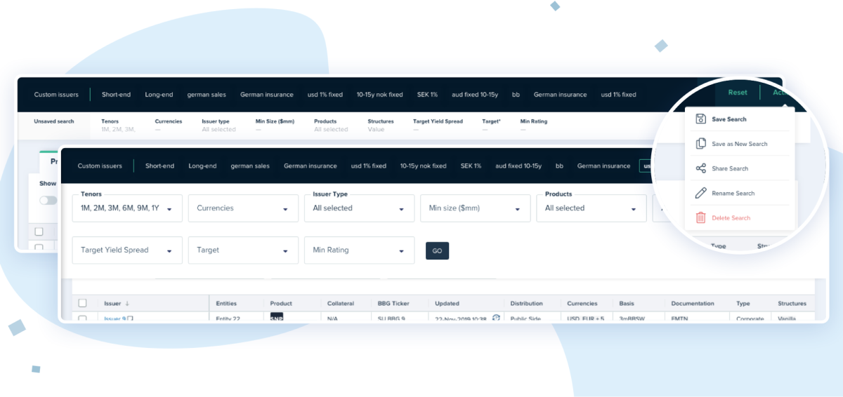
The search component sits atop the Funding Matrix view, offering quick access to saved searches. A glance at the collapsed search panel clearly shows the specified parameters. All actions for managing a saved search are conveniently grouped in a dropdown menu, readily available when needed.
optimising the grid
To ensure optimal performance across all devices, our development team rebuilt the Funding Matrix using a high-performance, user-friendly grid. This enhancement reduced the average loading time by over 70%.
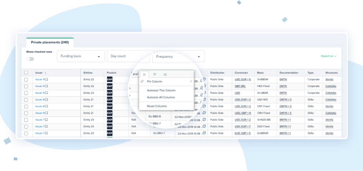
Alongside this optimisation, we redesigned the table to improve readability and display more results on screen. We fixed the table legend to the bottom of the page, allowing the table to occupy a higher position. Additionally, we relocated the grid's display settings—such as row filtering and column hiding—to the most intuitive location: the column headers themselves.
results so far
Throughout the process, we consistently consulted our users, gathering valuable feedback to ensure the product met their real needs. We revisited the drawing board numerous times, which ultimately helped us refine and create a feature of genuine value for our customers. However, this was just the beginning of our journey.
The Funding Matrix redesign resulted from meticulous study and observation of user behaviour. Our Beta version received overwhelmingly positive feedback, both for its enhanced user experience and improved performance in terms of loading speed.
next steps
After deploying the first version on the live platform, we continued to regularly test the new functionality. We made constant, incremental improvements to ensure it consistently met and exceeded our clients' expectations.
As we progress with our platform redesign, we'll continue to leverage Material Design to ensure consistent and robust performance.